UX Design project
Hidden arcade
Social media app
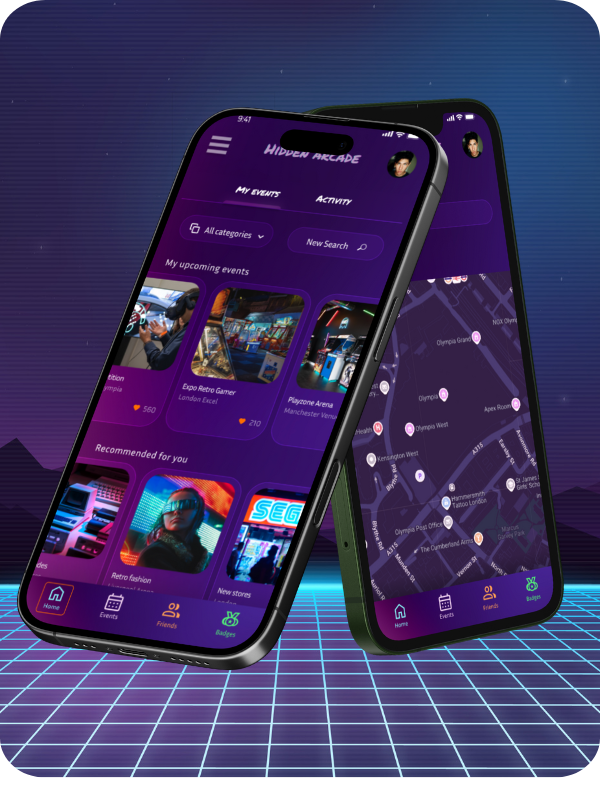
Hidden Arcade is an app to find the nearest arcade gaming conventions and events.
Users can connect with likeminded players and keep up to date with the latest news on the gaming scene.
They can also collect tags when they attend to events and earn badges as they use the app more frequently.
Overview
Hidden Arcade was developed as part of the Google UX Design Certificate program, which I completed in 2024. This app was the outcome of extensive user-centered research, planning, and prototyping. Apart from conducting a research, I focused on designing the screen layout and ensured that all visual elements worked harmoniously to create an appealing and intuitive user interface.
To begin the project, I identified a problem worth solving. With a strong interest in retro video games, I conducted informal interviews and online research to understand how arcade gaming enthusiasts engage with one another. I discovered that while retro gaming communities thrive on platforms like Reddit and at conventions or gaming events, many individuals expressed a desire to make new friends who share this passion. This insight led me to focus on creating an app that not only compiles information about upcoming events but also encourages connection among users.
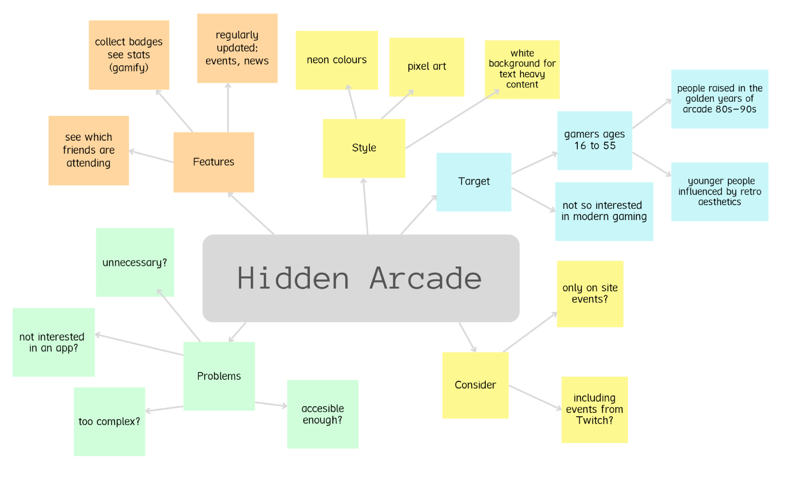
The name Hidden Arcade came to me early in the process—I wanted something that conveyed a sense of adventure while clearly reflecting the app’s purpose. With the concept and goals defined, I began organizing key ideas to guide the design phase.
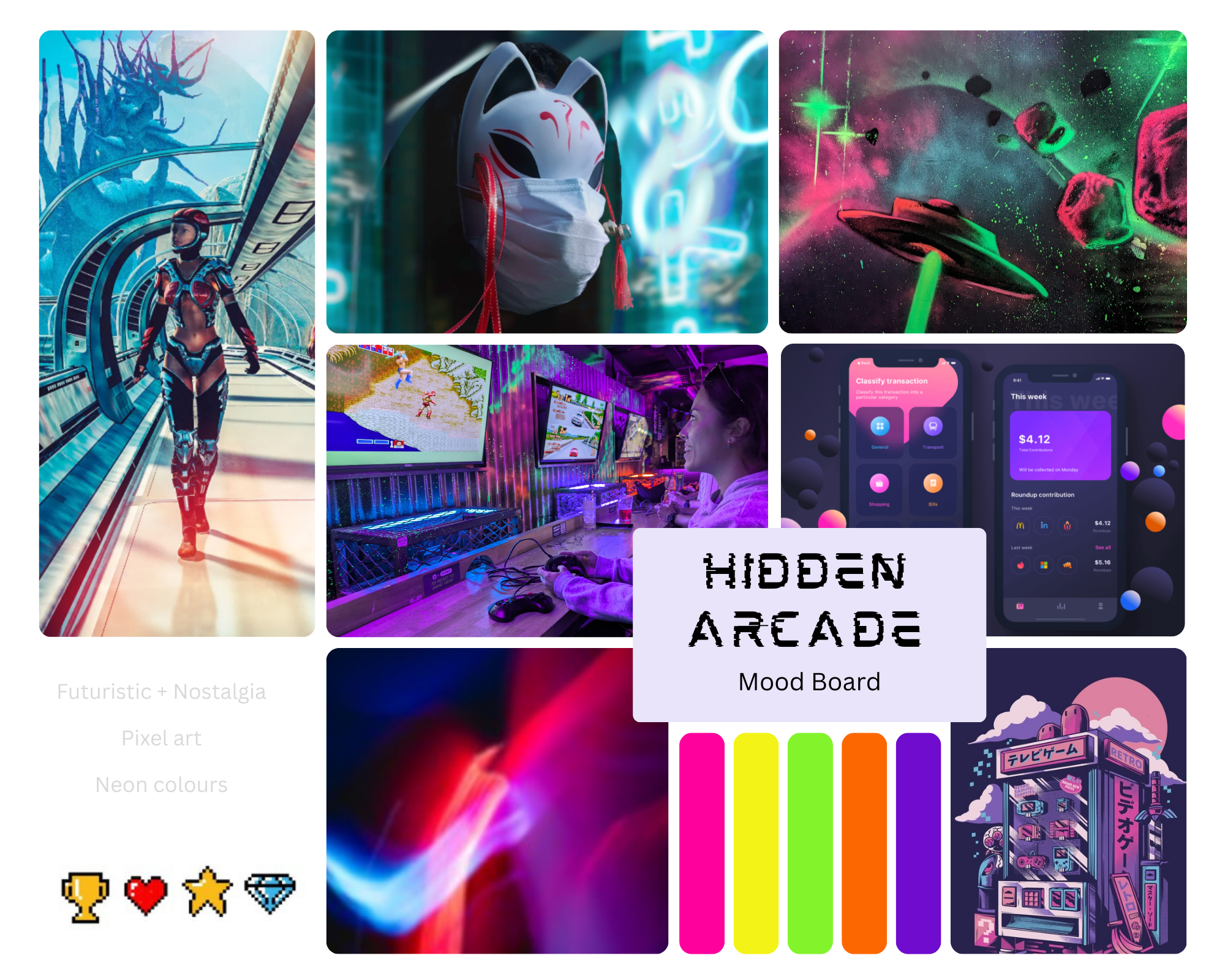
To establish the visual direction of the app, I curated a mood board featuring images that reflected the desired color palette and aesthetic. It quickly became evident that a neon color scheme combined with retro 1980s nostalgia would define the app’s overall tone and style.
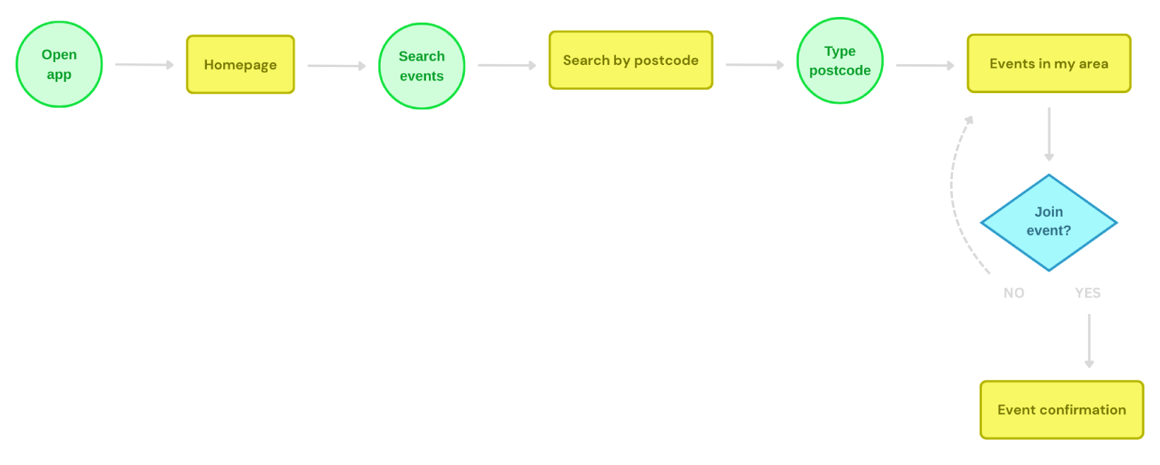
The user flow was my next focus. A typical user journey through Hidden Arcade begins on the home page, which features a calendar highlighting upcoming events. Users can browse events or utilize the search bar to find specific ones. Upon selecting an event, they are presented with detailed information. If interested, they can save the event to their personal calendar by selecting the “Attend” option, adding it to their list of upcoming activities.
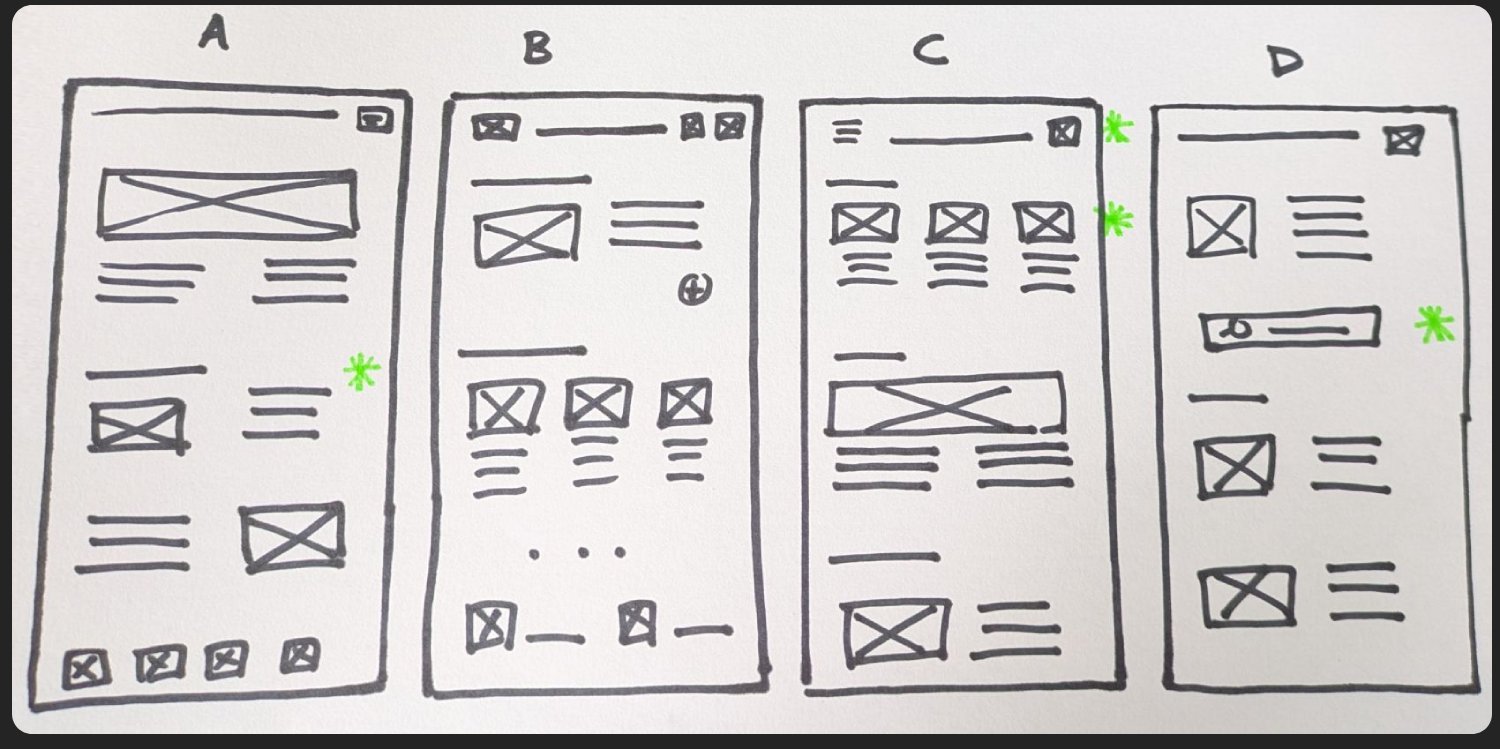
I was ready to start thinking about the design, so I started to make a few low fi sketches to have a rough idea of how I would build my home page. From them I chose the features that made more sense and put them all together.
Once happy with the sketches, l digitised the low-fidelity wireframes with Figma.
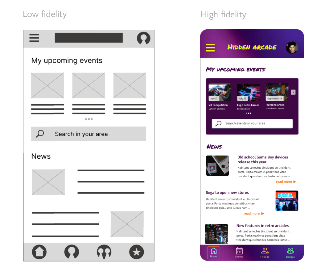
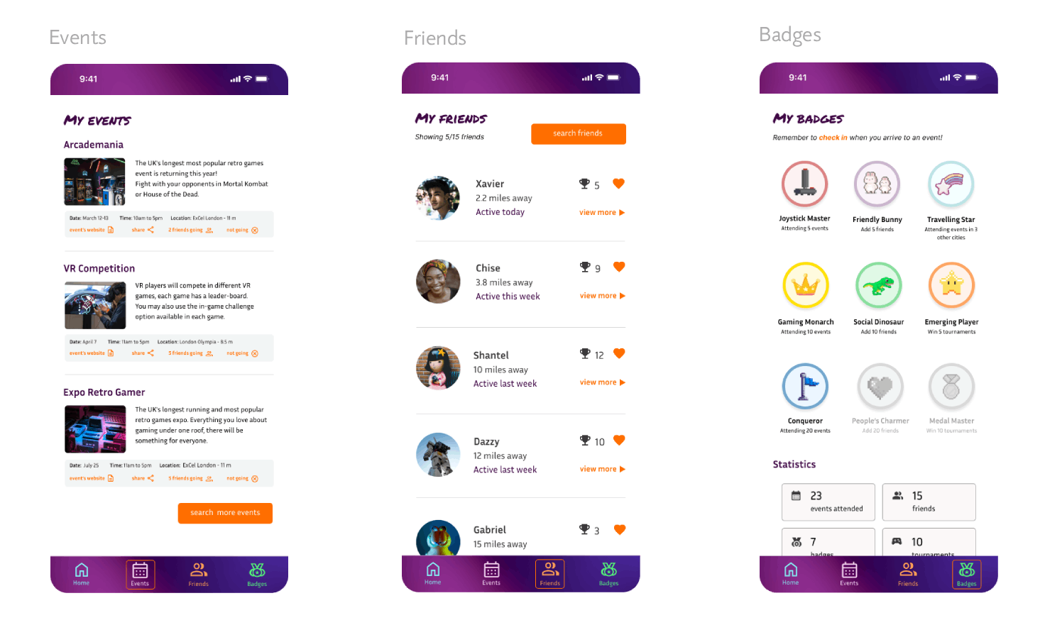
Once I was happy with the look of the home page, I continued creating other screens thorough the sections of the bottom navigation.
Next I created a prototype with the user flow in mind, performing the task of finding nearest events and joining to attend.
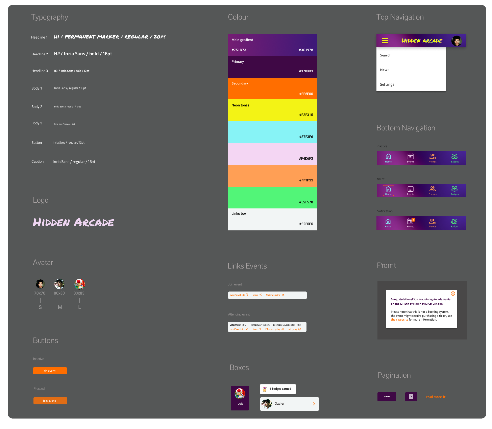
While working on the visuals, a design system was created, with a series of reusable elements and a set of components. All the design assets like buttons, the logo, icons, textboxes, etc, were described in it.
Usability study
A small usability study was conducted among several users who tested the design, performing the task of navigating through the homepage and booking an event in their area.
That way I could assess how easy it was for participants to complete core tasks in my design. It was an unmoderated study, allowing them to test it from home, with a set of open-ended questions to allow detailed feedback:
- How did you find the process of booking an event?
- Was there anything you would like to add in the process?
- Apart from choosing the event, seeing the friends that are going, visiting the event’s website, is there any other action you would like to perform?
- What do you think of the style, do you think it works or is it missing anything?
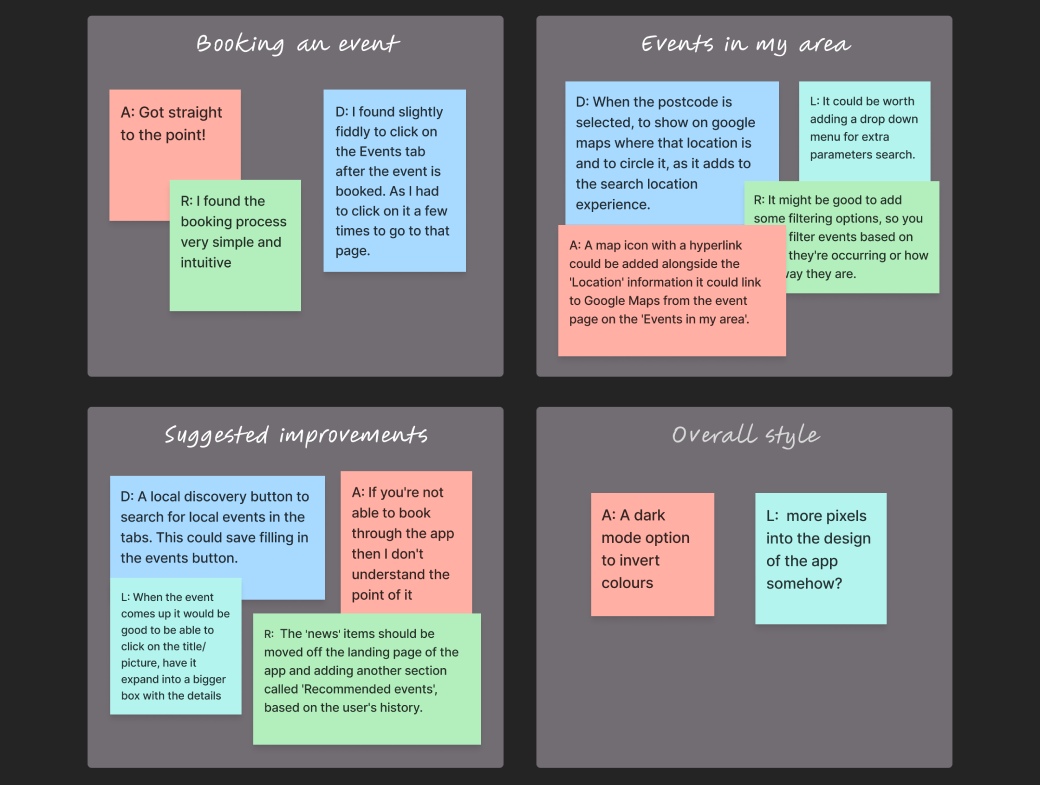
With the users’ feedback I was able to identify a series of common patterns and categorise them in my notes.
Iteration
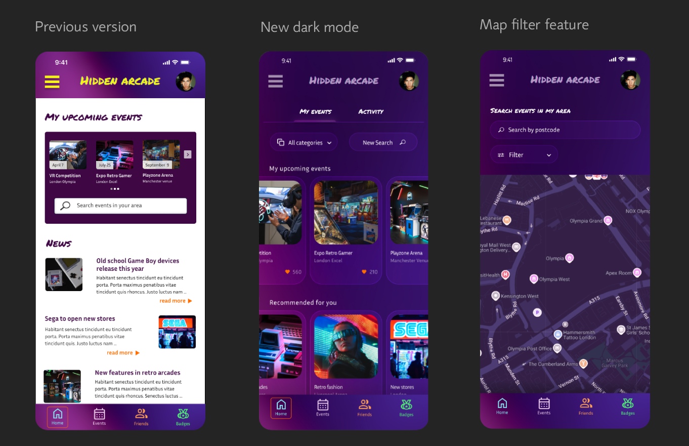
Based on the users’ feedback I learnt that there were areas of my app that would benefit from having more features, such as: the search button (adding filters and more parameters), and allowing the user to have more options of seeing suggested events in their area, letting them change the view to a darker mode, etc. Taking these into consideration I refined my design to make incremental improvements based on this feedback and users’ testing. This is still work in progress, but here are a few edits.
Conclusion
I am more confident about this app after the user testing and I am happy that I had such a valuable feedback.
Overall, the design has been complemented as “very clear and vibrant” and “attractive” so I take that as encouragement to keep adding features in that direction.
This app has lot of potential to be a regular tool enhancing the social life of retro arcade gamers. I’d definitely see it being used by many people connected by their passion, who want to stay in the know of future gaming events.
