Digital design
Consent Matters:
Boundaries, Respect and Positive Intervention
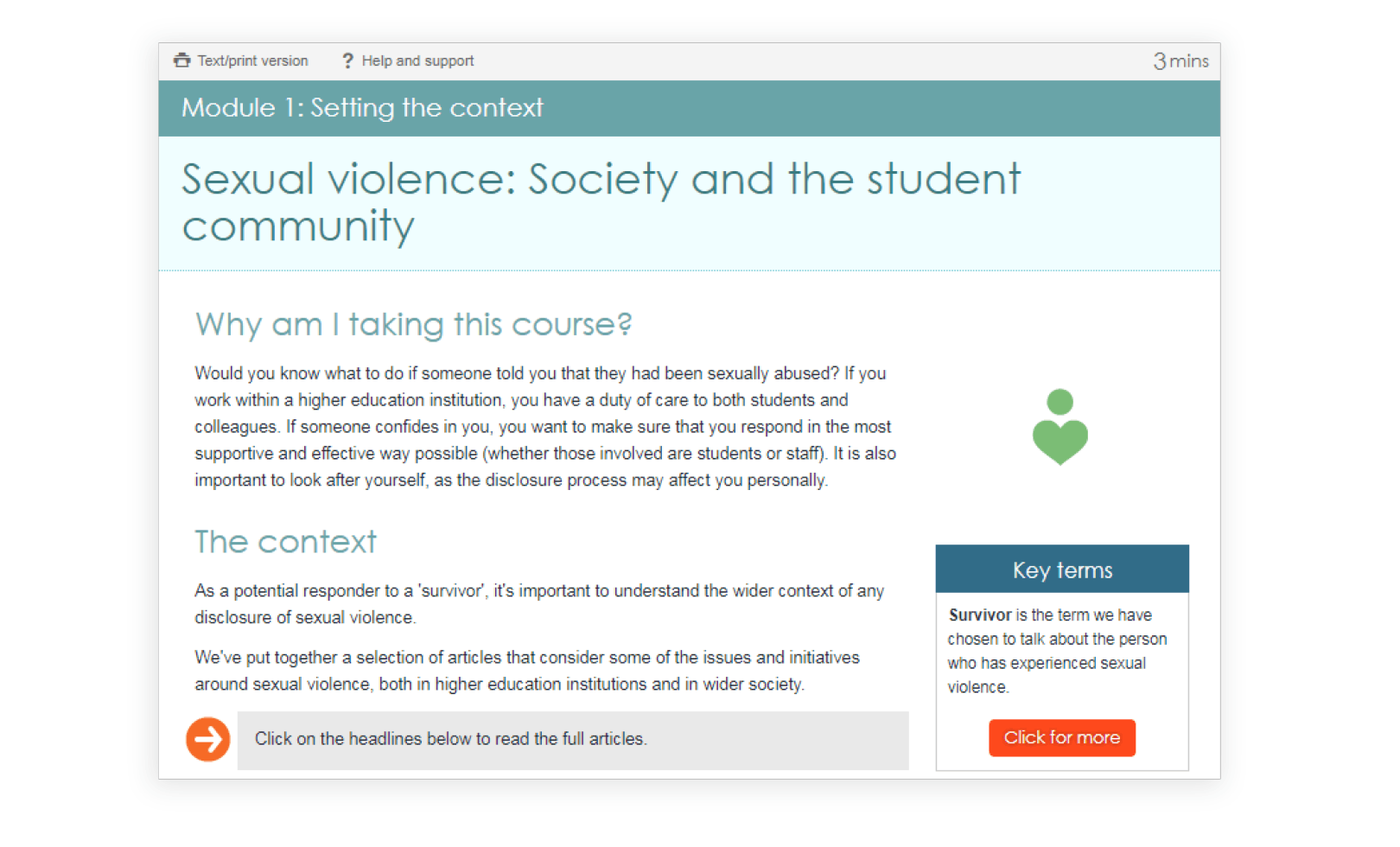
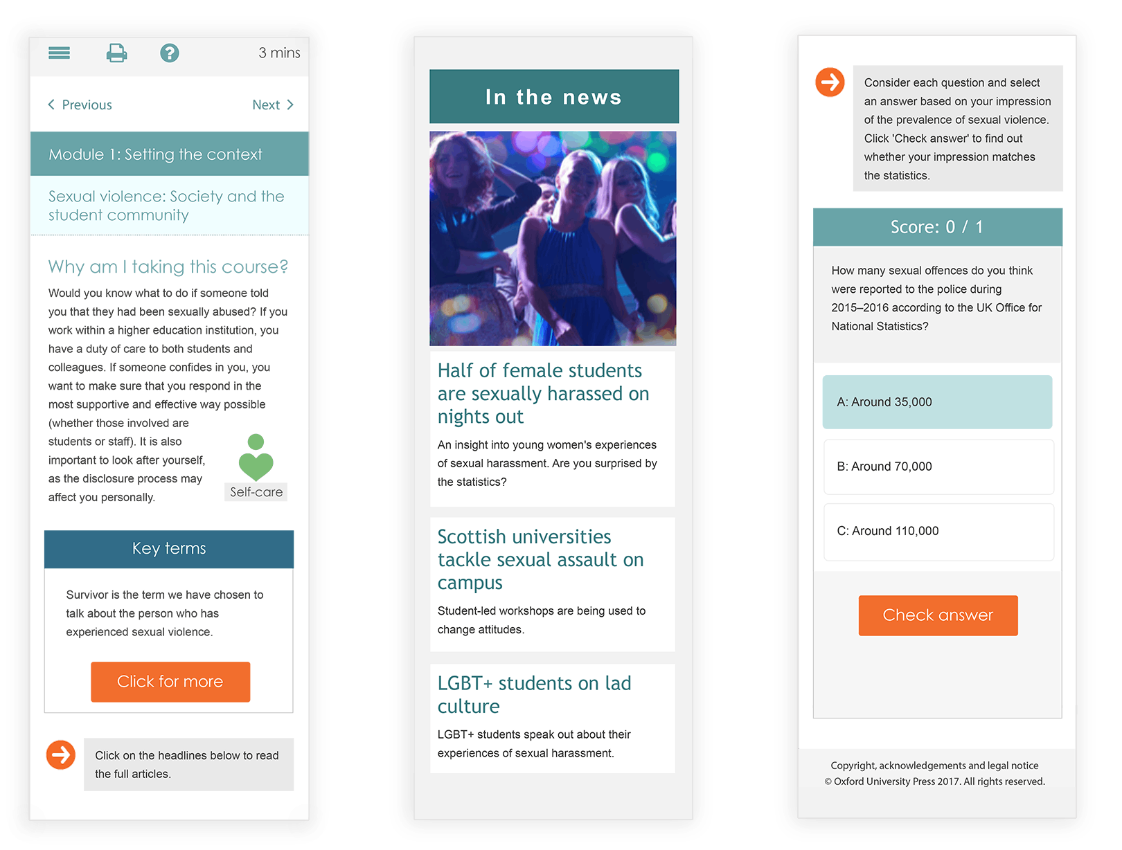
This programme was designed to help all students understand sexual consent, promote effective communication and respectful relationships.
I made this when I was working for Epigeum-Oxford Press. It won Gold in ‘Excellence in the Design of Learning Content’ in the Learning Technologies Awards 2017.
Overview
This online course was commissioned to Epigeum as a higher education training to help students’ wellbeing. As a part of the production team, I was in charge of the design and illustrations. Alongside the other designer, we had to find the tone of the course, before we could start defining the graphic elements and the way we would represent it. We wanted to convey sensitive information in an entertaining way while being rigorous.
Brainstorming process
Mood board
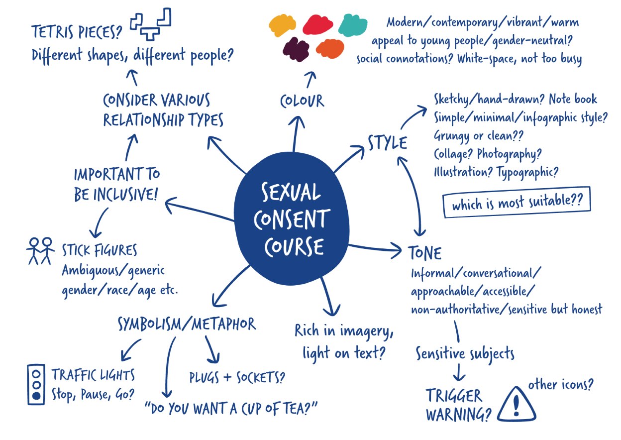
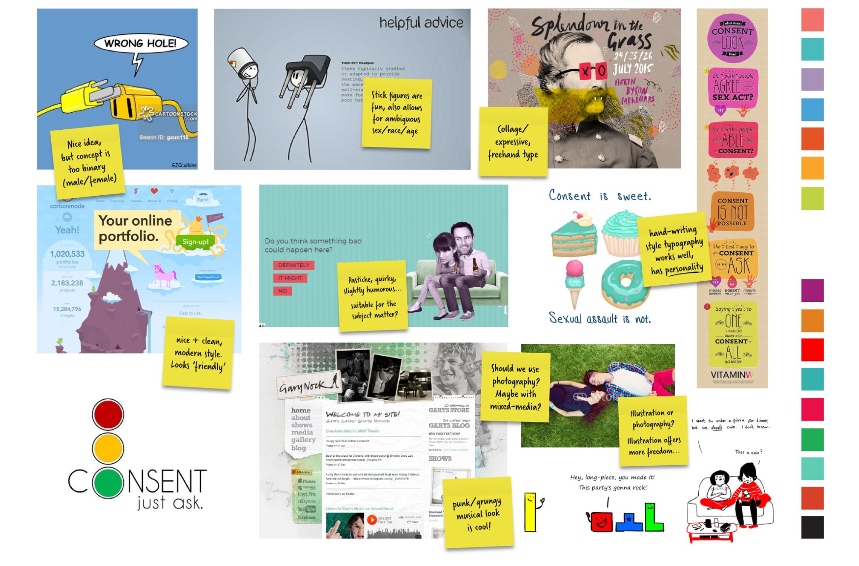
Once we had a rough idea of the direction we wanted to go in, we collected images for our moodboard, in order to try to find the right visuals for the course. We wanted it to have personality and appeal to young audiences without being too frivolous. There were some concepts that we had to reject since they were too binary (plug and hole symbols). On the other hand we wanted to have illustrations in order to have more freedom and stick figures were the best idea, since they could be a more ambiguous representation, however we also liked the photo collage.
Early concepts
A few mockups with the chosen concepts were created, we weren’t so sure about them, geometric shapes for the banner felt a bit boring and clinical, grunge aesthetic wasn’t our favourite and the collage effect seemed a bit busy.
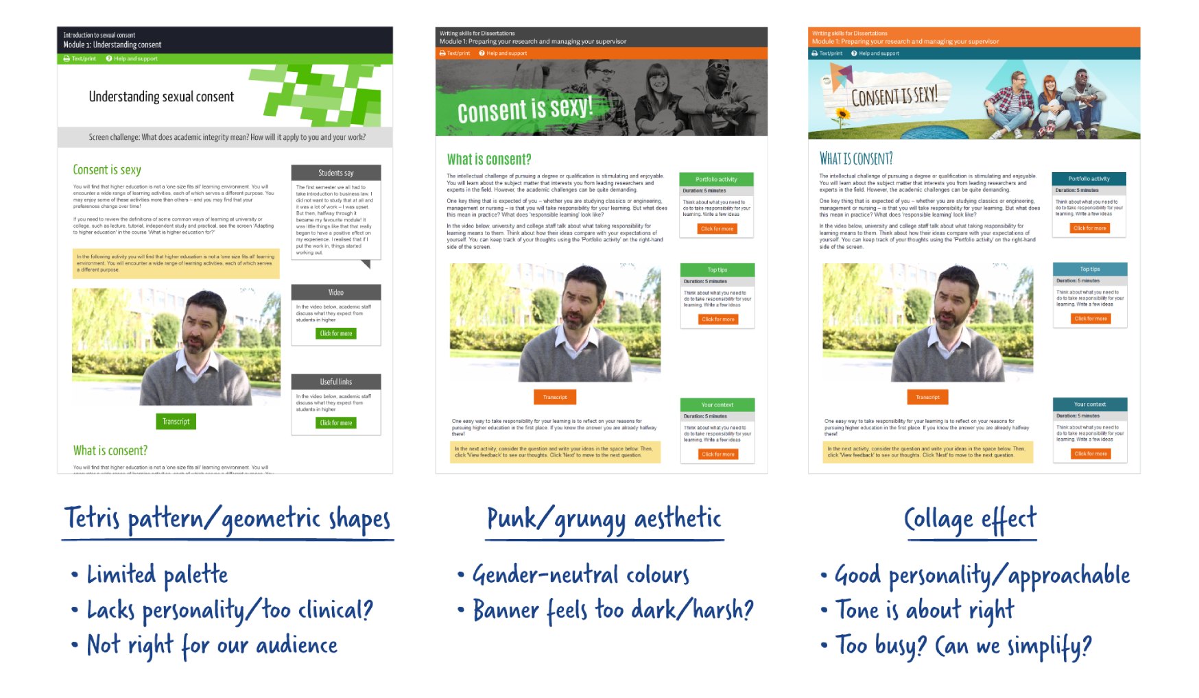
Illustration style
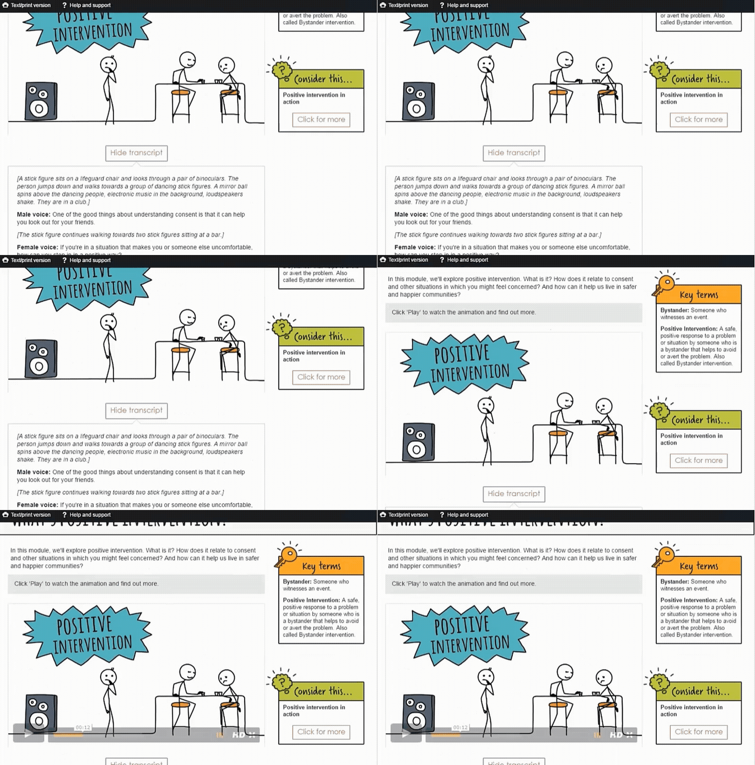
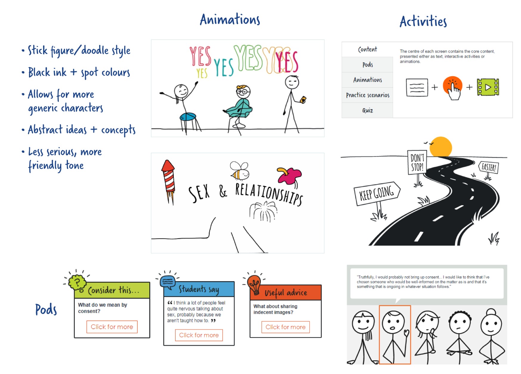
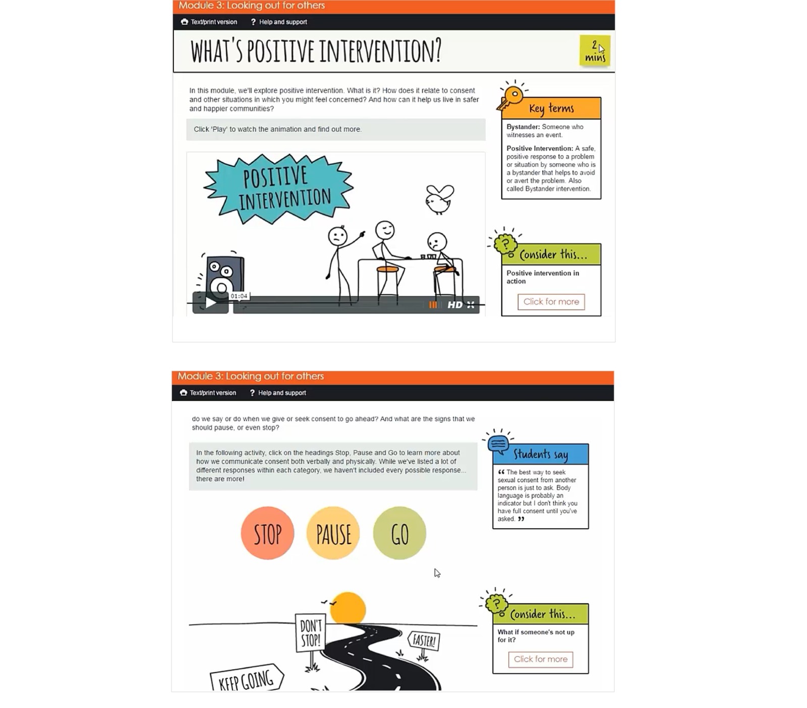
We decided to go for a friendly style, represented by a vivid palette of colour, alongside the stick figures from the video animations and black ink lines. The elements of the course are hand drawn, similar to doodles on a notebook with a hint of colour.
New icons were designed for the information pods, making them more appealing and distinctive.
Characters and comic strips
There were a few sections of the course that required a different tone, the comic strips and some quotes, for these a more serious tone was used and we added details to keep it realistic. I created illustrations of characters for different modules. We wanted to represent sensitive subjects in comic style and we needed the protagonists to be relatable, for a young person to feel the connection to the situations portrayed in them.
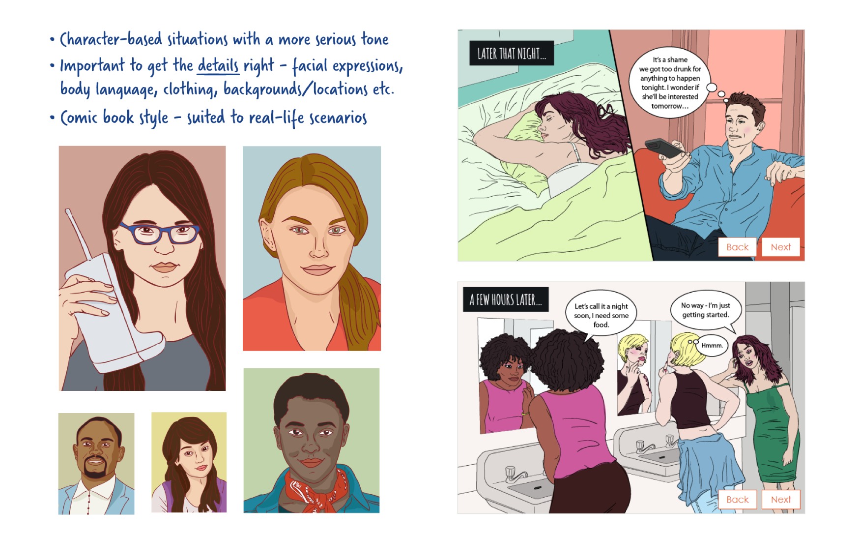
After its successful release, the course evolved to a more serious tone. We adjusted the colours and graphics to convey a different look. We replaced handwritten style fonts for modern ones and the pods became simpler and minimal.
