Mandarina Concept

Mandarina Concept was a brand created to represent a partnership of several photographers that worked in fashion photoshoots and events.
I was in charge of the logo, the website, the marketing materials and I was one of the photographers as well.
For the logo, we wanted something fresh and quirky, to represent our values of photography made casually yet professionally, so the idea to combine a mandarin orange peel and a camera lens was something we were keen on.
I came up with the final logo design, with tangy orange colours in contrast with the black of the lens, and we based our materials on that. The colour palette was inspired by the fruit, so the background colours were muted and had high contrast.


The fruit and the diaphragm centre of the logo were recognizable components, they could be used as a brand mark so it was easy to use as a favicon or square avatar.

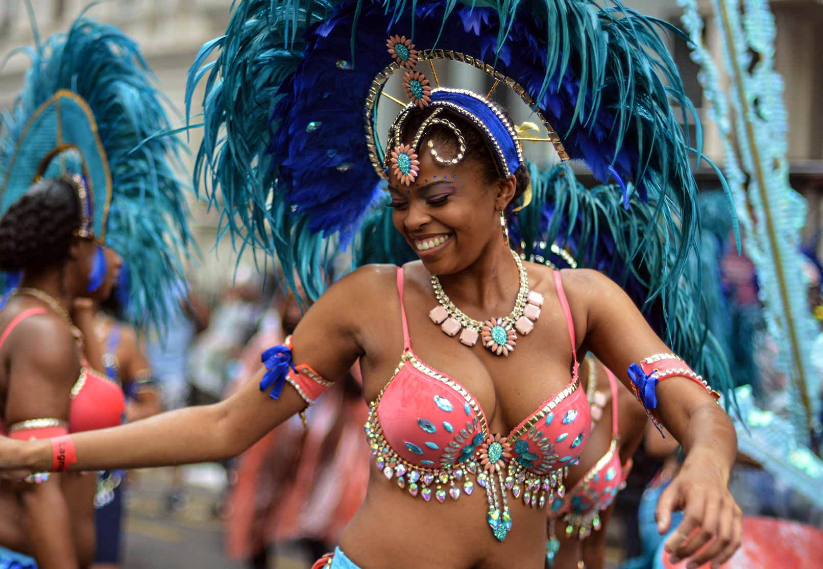
For the website I used light colours with the orange of the logo as an accent, and focused on the pictures of the different events and photoshoots, with plenty of galleries to showcase the best work.

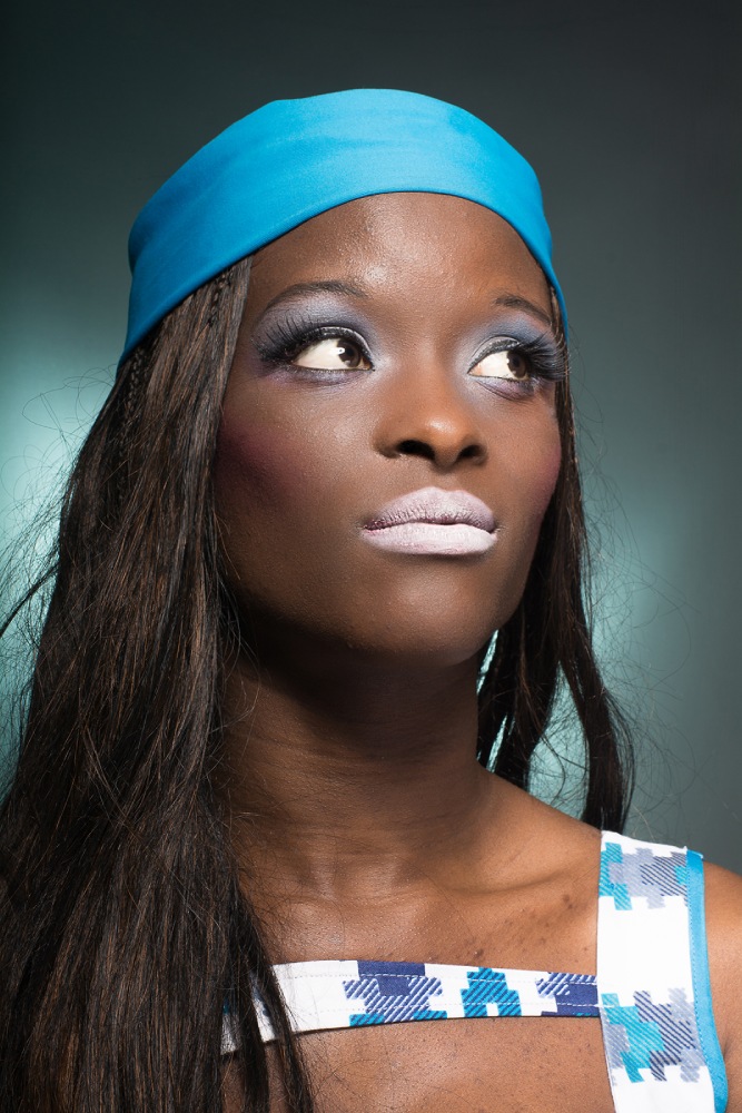
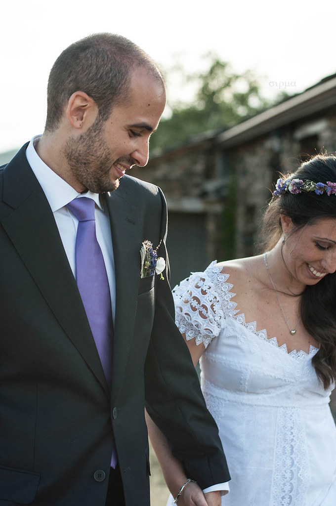
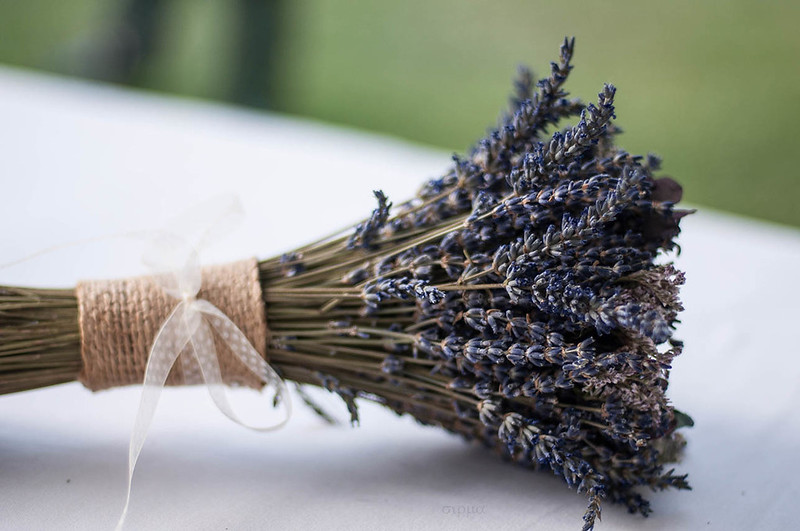
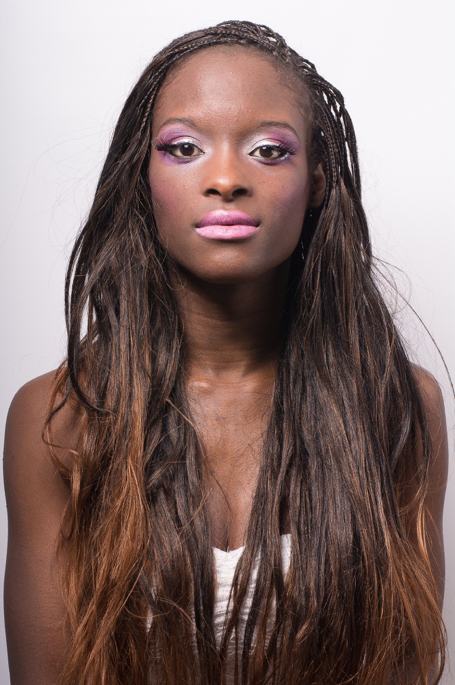
Gallery